I. Introduction
Microsoft Excel is a powerful tool that provides many features that can simplify data analysis. One of these features is trendlines which can help in identifying trends and patterns in data. A trendline is a graphical representation of the relation between two variables in a data series. It is used to predict future trends, analyze past data, and identify patterns in data. In this article, we will explore how to add trendlines in Excel, providing a step-by-step guide, video tutorial, and tips for interpreting trendlines.
II. Step-by-Step Guide
Adding a trendline in Excel is a straightforward process. Follow these steps to add a trendline in Excel:
Step 1: Open your Excel workbook and select the chart where you want to add a trendline. Click on the chart to select it.

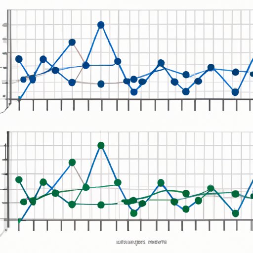
Step 2: Go to the Chart Tools tab and click on the Design tab. In the Chart Layouts section, click on the Add Chart Element dropdown, locate Trendline, and click on it.

Step 3: A dropdown menu will appear. Click on the type of trendline that you want to add. Excel offers different types of trendlines, including linear, exponential, logarithmic, polynomial, power, and moving average.

Step 4: The trendline will now appear on your chart. To format your trendline, right-click on it and select the Format Trendline option.

Step 5: In the Format Trendline pane, you can customize the appearance and behavior of your trendline. For example, you can adjust the transparency, color, dash type, and thickness. You can also specify whether to display the trendline equation and R-squared value.

III. Video Tutorial
If you prefer a video tutorial, check out this guide by the Excel Easy website on how to add a trendline in Excel: https://www.youtube.com/watch?v=xdejTmKJwQA. The video provides a clear and concise demonstration of each step of the process, making it an excellent resource for visual learners.
IV. Use Cases
Trendlines can be helpful in many different use cases. For example, they can help to:
1. Prevent data analysis errors: By adding a trendline, users can identify patterns and trends in data, allowing them to identify and correct data analysis errors.
2. Predict future trends: Trendlines can show users the direction in which their data is heading, allowing them to make predictions about future trends.
3. Identify patterns: Trendlines can show users the shape of their data series and highlight patterns that may not be obvious at first glance, allowing them to identify hidden insights.
For example, suppose you are working with a sales dataset for a specific product. By adding a trendline, you can predict future sales, identify patterns in sales over time, and make informed decisions about how to increase your sales.
V. Tips for Interpreting Trendlines
Interpreting trendlines can be a little tricky, especially if you are new to data analysis. Here are some tips for interpreting trendlines:
1. Adjusting for data outliers: If your data contains outliers that are affecting the trendline, consider removing them or adjusting them to better reflect your data series.
2. Be aware of different trendline types: Different types of trendlines, such as exponential or polynomial trendlines, may be appropriate for different types of data series. Make sure to select the right trendline that fits your data series.
3. Extrapolating with caution: Trendlines should be used to analyze past data and to identify patterns. When using trendlines to make predictions about future trends, it’s important to be cautious and not rely solely on the trendline to make predictions.
VI. Highlight Differences between Excel Versions
Adding a trendline in Excel is a standard process, but there may be some differences between Excel versions. For example, in Excel 2010, the Add Chart Element button is found on the Layout tab. In Excel 2013 and later versions, the Add Chart Element button is found on the Design tab. Be sure to read the documentation for your specific version of Excel to ensure that you are following the correct steps.
VII. Conclusion
Adding a trendline in Excel can make data analysis easier by helping you to identify trends and patterns. With this step-by-step guide, you can add trendlines to your charts in just a few clicks. Take advantage of the different trendline types, customize the appearance of your trendline, and interpret your data with confidence.
If you have any questions or need additional resources, be sure to check out Microsoft’s official documentation or the Excel Easy website for more information on getting the most out of your Excel charts.


